Featuring classic patterns, dynamic modern designs and a mix of materials, wallpaper -which dates back to Egyptian and Roman wall paintings – is back.
Wall coverings in homes emerged in Europe during the Middle Ages, when the upper classes used intricate and decorative tapestries as décor and to minimize drafts.
The use of wall coverings boomed during the Renaissance with beautifully woven fabrics used as decoration on walls, tables and doorways.
Around this time, paper was introduced as a less expensive, more practical alternative to fabrics and tapestries.
With glimmers of optimism in the economy, homeowners are more confident and ready to change their homes and experiment with different colors and design styles that reflect the following trends emerging in 2014.
Back to basics. Black and white will be popular for 2014. Both are timeless classics and can be easily juxtaposed with different colors and textures. Charcoal will remain de rigueur.
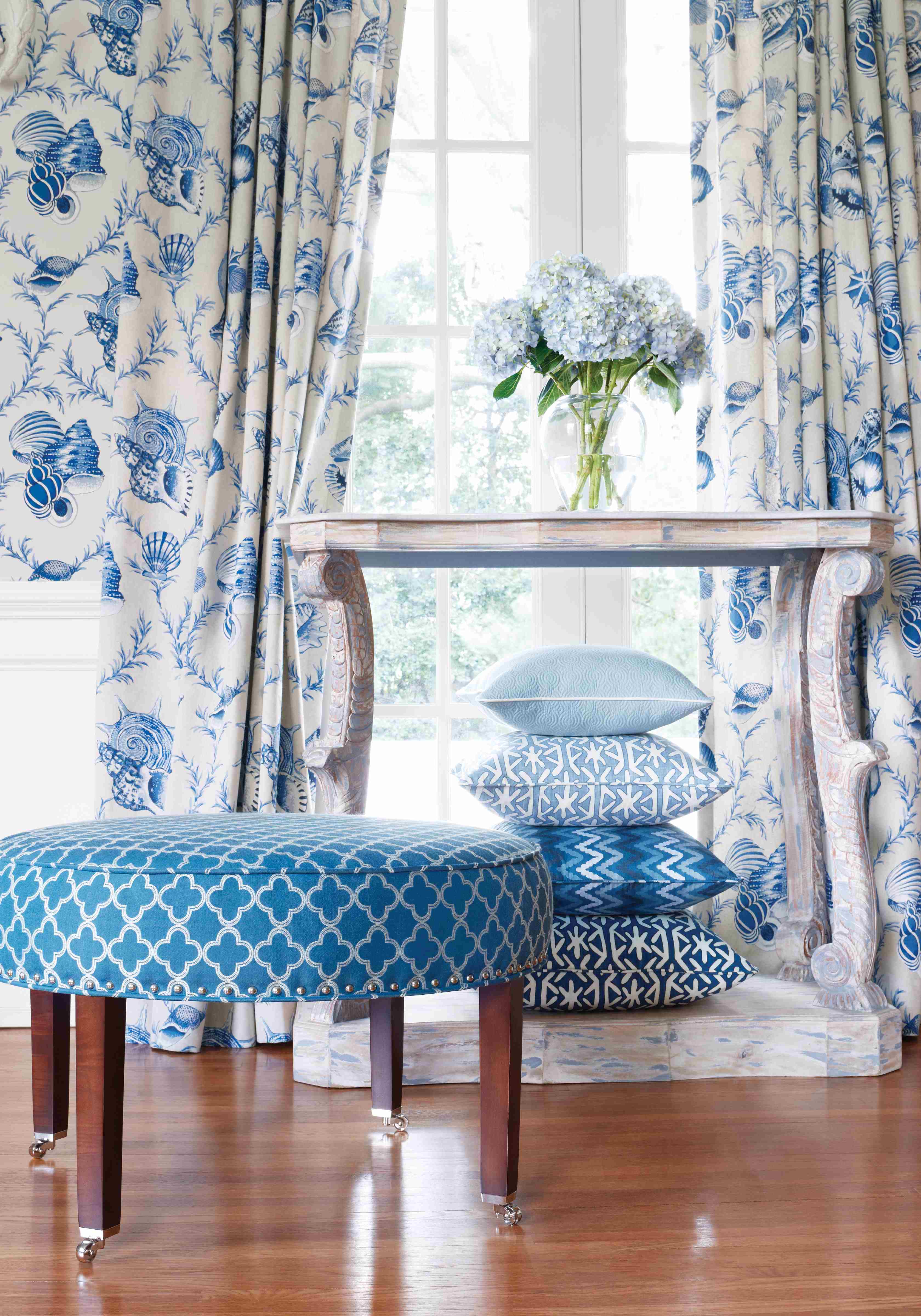
Pops of color. Vibrant hues such as coral, yellow-green and bright blue and green will dominate infusing vivid accents into neutral palettes. You can never go wrong with a blue and white combo.
Today, anything goes in holiday decorating. Gone are the days of simple red and green décor. While these colors are still important, holiday accents now run the color spectrum from amethyst and deep blue to metallic to bright white and ivory.
Our mantra this holiday season? Keep it simple and ultra-chic with a personal flair. Read on for timeless decorating tips that will add fun and festivity to your holiday home this season:
Always use fresh items in your décor like evergreen and tuberoses because the scents of the season are as important as the visuals.
With this in mind, use scented candles and fragrance diffusers throughout your home – cinnamon sticks also add a wonderful aroma.
Create a vignette of your favorite ornaments, photos or mementos. This works well in an entry hall, sitting area or front porch.
Consider reducing your color palette to one color plus a metallic such as gold or silver. For a modern look, a cool white pairs well with many colors.
Daylight savings time is around the corner and spring is in the air! In addition to some serious spring cleaning, it’s time to refresh and reinvent your decor for the warmer months ahead.
Add bright, color fabrics in fun patterns like these from Thibaut.
Infusing a fresh look into your home for the coming season can be as simple as purchasing new accessories or adding bright new colors. Following are some ideas:
Change out a few items in a room. Paint dark wood trim a glossy white; add decorative, colorful pillows; paint the ceiling a color that pops; layer bright damask scarves on colorful tablecloths; add a bowl brimming with seashells; assemble five or six glass vases and fill with brightly colored marbles; install colorful new lamp shades.
Freshen up your bedroom with a colorful new duvet cover and replace dark or heavy drapes with breezy white sheers.
Rematting framed photos can make a big difference. Paint mattes with ordinary house paint, using vivid colors that accentuate.
Add colorful flowers to keep your room fresh and seasonal. Fresh fruits are a wonderful accent too. Fill a big glass bowl with lemons, apples or tangerines.
Colorful flowers keep a room fresh and seasonal.
A coat of fresh paint can brighten your home, and bold colors are big this season. Create a vibrant palette by listing out colors you like. Then ask your local paint store for “drawdowns” of the colors you choose. Drawdowns are larger samples – usually 8″ x 12″ – and easier to work with than small cards. Cut the drawdowns into four paint swatches, so you can easily mix and match colors to see what works.
Create a color palette for spring that consists of at least one warm, one cool, one neutral and one additional slightly edgy color that juxtaposes the others. Don’t play it safe – take a color risk!
Add some sass and sparkle to your home with metallic accents and accessories. A hint of bronze or silver adds shimmer and an element of interest. Try vases, picture frames, lamp bases and more.
Purchase new and colorful area rugs, which can alter the look of your room by setting the tone and color palette.
Scent matters too. Choose deliciously scented candles and flowers that smell like spring, such as lilacs, roses and gardenias.
If you opt to make significant changes to your home this season, always think about “scale,” and ask yourself “What is the proportionality of this change in relationship to the existing surfaces?” What surfaces impact the room the most? For example, changing an area rug will make a significant difference because of the amount of floor space that is affected. Make a list of changes that are important and identify which items are more critical than others. Then itemize the changes, along with the time frame and cost for each.
Metallic accents add sass and sparkle.
Happy spring! As always, feel free to email me or post on our Facebook page with questions, comments or pictures of your spring changes!
For many reasons some homeowners choose to live in smaller homes or townhomes – for lifestyle, convenience, budget and more. Yet a compact residence need not limit your design options. There are many techniques to make a tiny space appear larger. Following are a few tips to bring out the very best in a small space:
Use light colors and neutrals in a monochromatic scheme. While dark colors can provide a “wow” factor, they are not ideal in a small space and can make a room appear smaller than it is. The lighter the shade of the room, the more airy and open it will feel.
A compact residence need not limit you design wise.
Choose one unifying paint color. Using one color makes a room appear more expansive, so keep contrasting colors to a minimum. For example, draperies should ideally be a similar hue as the wall. Also consider furniture that blends seamlessly with floors and walls.
Let the light in. An abundance of natural light can especially enhance a small space. Use window treatments, blinds and shutters sparingly. If you’re remodeling, build in extra-large and well placed windows.
Stripes widen a space. If a space is ultra small, not all types of rugs will do, a good remedy is striped walls or flooring, e.g. a striped rug or painted/contrasting wood can make a room feel larger.
Vertical lines lengthen. Vertical lines can also make a room feel taller. For example, purchase a four-poster bed. Or Install crown molding around the perimeter of the ceiling – this will draw the eyes up.
Use glass. Since glass gives the illusion of space, incorporating glass tabletops, doors and glass cabinet panels pulls eyes beyond the glass.
Glass tabletops, doors and glass cabinet panels pull the eyes beyond the glass.
Pocket doors. These doors conserve space by sliding in and out of the wall, so you don’t have to leave space for doors to open.
Clear clutter. A clean, uncluttered space appears much larger than one filled with accessories and knick-knacks. Keep your design simple and avoid unnecessary frills.
Mirror, mirror. Groups series of mirrors together or place an oversized mirror behind a key piece of furniture to create depth. If you are feeling bold and really want to make your room look larger install a mirrored wall.
Mirrors create depth and make a room appear larger.
Multifunctional pieces. Use furniture that serves multifunctional purposes, like a platform bed with large drawers underneath or an ottoman that can be used for storage.
Built-ins. Built-in bookshelves provide much needed extra space in a small room and can meld beautifully with a room’s overall design.
Limit pattern. If you really love patterns, try smaller prints. Too many patterns in a small room will overwhelm the space.
Purchase a few quality pieces of furniture. Avoid large, overstuffed pieces. Furniture with legs feels less heavy and cumbersome than pieces that sit directly on the floor. Do opt for a few lightweight pieces that are portable.
Mirrored cabinet backs help give the illusion of space.
Most importantly, when you design a small space, look at everything with an editor’s eye. If you own an accessory or a piece of furniture you’re not crazy about, give it away or donate it.
Remember, less is more – especially in the case of a small space.
With the new year upon us, it’s time to think about décor trends to watch for in 2013.
Whether you’re planning a total renovation or a simple update this year, take careful note of the latest trends and design predictions. But even with this in mind, always design for longevity and practicality.
Vibrant colors: Color is a key, but evolving, aspect of interior design. Colors this year are bright, fun and fresh with greens emerging at the forefront in vibrant emerald and jade hues. While brown is still popular, it has a red cast with cinnamon overtones; tangerine orange has been replaced by paprika; and while bright red remains popular, fuchsia is white hot. Steel blue and navy continue as perennial favorites.
Stripes will be big for 2013 ( Cowtan & Tout)
Transitional takes off: Sleek contemporary design is softening with textured fabrics and rounded lines, making way for a more transitional look – an appealing mix of traditional and modern motifs.
The classics: Classic patterns prevail, with a return to stripes, florals, paisleys and more on walls, ceilings and fabrics.
Classic fabrics such as this floral pattern by Cowtan & Tout are making a comeback
The floor: Hard surfaces versus carpeting take precedence. For flooring look to stone or, perhaps, woods like hickery, mahogany, pine and cherry. Cork and bamboo are very popular sustainable choices.
Classic wood flooring will remain popular throughout the coming year
Metal trends: Chrome and nickel are out but metal finishes including satin, brushed gold and pale bronze tones are in. Brass is also in vogue this year.
Going green: Reclaimed and repurposed materials – among them wood planks, bricks, glassware, metals, wall coverings, natural fiber carpets and more – are popular, and locally produced and crafted products are in hot demand.
Heart of the home: Vintage style kitchens continue in popularity accented by beautiful weathered concrete, natural crackle-glazed tiles and rough-hewn wood floors.
Kitchens with a vintage appeal will be in demand
What’s old is new: Antique furniture, materials and accessories remain de rigueur, but many incorporate a contemporary touch – such as modern fabrics or a coat of glossy paint – for a transitional look.
What else do you think is hot on the design scene in 2013? Let me know and send us some photos – we might post them on our Facebook page.
I’m often asked, “How do you design a room”? or “How do you begin the design process? It seems so difficult!”
It’s really quite simple.
The style of the fabrics is vital to determining the design of the room
I begin by finding a “key” fabric I love. I determine if the design theme will be contemporary or traditional, and then work carefully with the fabric’s style and color palette. In essence the “key” fabric becomes the driving force and foundation behind the room’s overall design.
If the fabric is a solid color, I will find other fabrics – solids or patterns – that are complementary, creating a comprehensive color palette that includes two cool colors and one warm color or vice versa. Next, I locate a neutral colored fabric, so I am working with at least three colors and one neutral.
The style of the fabrics I select is vital to determining the design of the room – and whether it will ultimately be contemporary, traditional or transitional.
Begin the design process by finding a key fabric you love
Once the color scheme as a whole is settled, I begin to assemble other complementary fabrics – with an ideal selection of at least three dozen or more fabrics from which to choose. After I have finalized the fabrics, I lay the swatches on a white (so not to confuse or prejudice the coloration for the room) table or large white poster board.
With my color and fabric swatches chosen, it’s time to assign the fabrics to the various furnishings, draperies and other room elements. I write on the back of each fabric swatch clearly identifying where in the room it will be used, avoiding too many of one specific pattern. I like having a nearly equal number of solids, florals, plaids and stripes avoiding an abundance of one particular style.
Now I can bring in wall coverings and carpeting that round out the fabrics I have chosen. Next I am ready to select the various furnishings. Slowly but steadily, the room comes beautifully together.
The lobby at the Grande Colonial Hotel in La Jolla, California
Throughout the design process, I try to avoid frequent starts and stops, so I can maintain the momentum and excitement that comes with designing a space.
When everything is in its place, I fine tune the process by stepping back and looking at each finish, each furnishing and each detail with a critical eye, visualizing where it will lie in relation to everything else in the room. However, whatever finessing or changes I make at this point, I always keep the original foundation fabric in my mind.
And that brings me back to my original point: Choosing a core fabric that you simply love will ideally evoke your personality – and set the entire tone for your design scheme.